tags: Harry Potter and the Half-Blood Prince, movie posters, poster teasers

Well, not many people have responded to my Harry Potter and the Half-Blood Prince movie poster poll, so I am asking you once again, whichy poster do you like best? I’ve linked to each of the posters from the poll itself so you can look at them all and decide which you want to vote for, too.
The poll is reposted below the fold for your convenience.
| Which Harry Potter and the Half-Blood Prince poster is your favorite? | |
| Poster 1 | |
| Poster 2 | |
| Poster 3 | |
| Poster 4 | |
| Poster 5 | |
| Poster 6 | |
| Poster 7 | |
| Poster 8 | |
| Poster 9 | |
| Poster 10 | |
| pollcode.com free polls | |

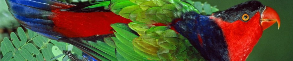
I’m sorry, but I have been enjoying your bird photo’s and the subway art too much to even really notice the Harry Potter posters.
This time of year, in the desert around Palm Springs, all but the most desert adapted birds are gone, and as much as I appreciate cactus wrens and ravens, I look forward to your bird photo’s.
I have to admit I thought a number of the poster somewhat lacking, even a little amateur. One issue a lot of them have is objects appearing “in space”, not grounded on something, for example trees with no ground, so that there is no reference point for them. This may sound like a nitpick, but I was taught this was a basic no-no in photography years ago…
Some simply lack meaning to my mind.
I favour poster 4 in that the basics are right and it includes elements that are familiar to viewers of the films or readers of the books, while having some atmosphere.
In some the green is too florescent for my tastes, e.g. poster 7 (although kids might like it).
The first poster brings Harwood’s Hole in New Zealand to mind!
yeah, the florescent posters do tend to be somewhat .. obnoxious. i can’t figure out why it is such a popular color among the poster designers.